React Props: Build a Styled Headline Component with TypeScript
Want a reusable, design-perfect headline for your app without rewriting styles for every page? In this tutorial, you'll master React props by building a typed Headline component that's semantic, accessible, and easy to maintain.
We'll cover props vs children, optional and default props, a fully typed as prop, styling strategies, testing, and performance—all while wiring it to a real design workflow using Pretty Headline.
What You'll Build and Why React Props Matter
You'll build a Styled Headline component that renders h1–h6 via an as prop, supports variants, color, alignment, optional underline/highlight, and forwards native attributes. This is a practical way to learn react props because each visual and semantic choice is driven by the component's inputs.
Using props in React keeps a one-way data flow: parents pass data down; children render based on those inputs. This separation makes your UI more predictable and testable. The React team calls props "read-only snapshots" passed from parents to children—see React's guide on passing props.
h1 to h2 with as without duplicating components.aria-*, data-*, and id for accessibility and testing hooks.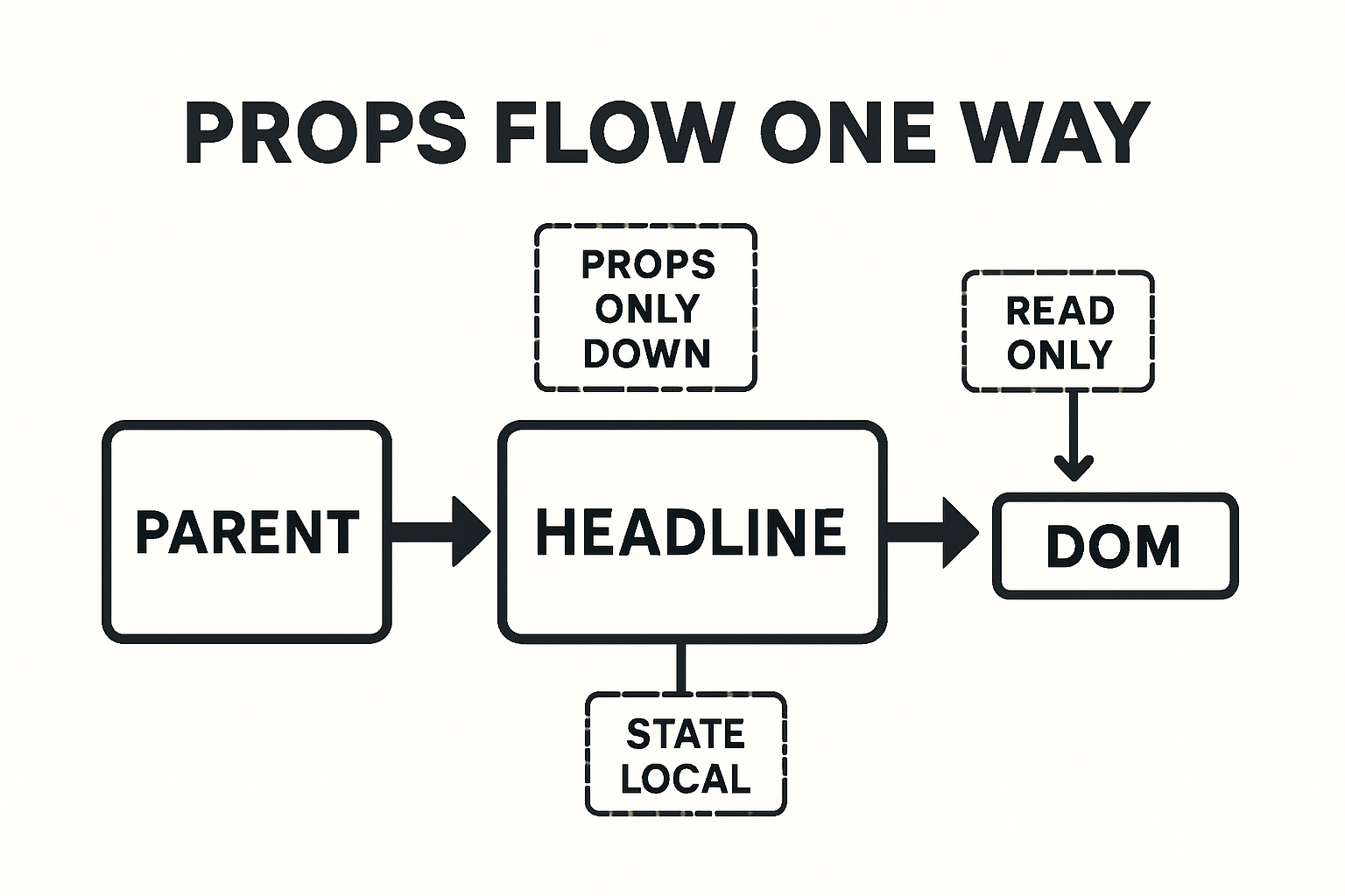
Prerequisites and Starter Setup
You can follow along with Vite or Next.js (React 18+). Both JavaScript and TypeScript examples are included (.tsx where relevant).
- Create app:
npm create vite@latest my-app -- --template react-tsornpx create-next-app@latest - Run dev server:
npm run dev - Add a components/ folder:
src/components/Headline.tsx
Tip: If you prefer a quick design-first workflow, you can start from a headline designed in Getting Started with Pretty Headline and then map it to your typed props.
React Props Basics for Headline Components
Props vs state (fast definition): Props are inputs from a parent and are read-only; state is local, mutable data that a component owns. This distinction keeps components predictable. See React's official props guide and this overview of props vs state differences.
Props vs Children: Picking the Right API
For a headline, you can accept content via a text prop or via children. Prefer children when you need inline markup (e.g., <em>, <strong>, emojis). Use a text prop for simple strings from CMS data.
Optional and Default Props Patterns
Function components don't need defaultProps. Use parameter defaults and nullish coalescing (??) instead. This is safer with TypeScript and avoids edge cases.
type Level = 'h1'|'h2'|'h3'|'h4'|'h5'|'h6';

interface HeadlineProps {
  as?: Level;
  variant?: 'display'|'hero'|'title'|'subtitle'|'eyebrow';
  align?: 'left'|'center'|'right';
  underline?: boolean;
  highlight?: boolean;
  text?: string;
  children?: React.ReactNode;
}

export function Headline({
  as = 'h1',
  variant = 'hero',
  align = 'left',
  underline = false,
  highlight = false,
  text,
  children,
}: HeadlineProps) {
  const Tag = as;
  const content = children ?? text ?? '';
  return <Tag className={`h-${variant} align-${align} ${underline ? 'u' : ''} ${highlight ? 'hl' : ''}`}>{content}</Tag>;
}
Step-by-Step: Build a Styled Headline Component
We'll implement a production-ready component with strong TypeScript types and safe prop forwarding.
Define a Strong TypeScript Props Type
import * as React from 'react';
import clsx from 'clsx';

type Level = 'h1'|'h2'|'h3'|'h4'|'h5'|'h6';
type Variant = 'display'|'hero'|'title'|'subtitle'|'eyebrow';
type Align = 'left'|'center'|'right';
type Color = 'default'|'muted'|'primary'|'accent'|'success'|'danger';
type SizeToken = 'sm'|'md'|'lg'|'xl'|'2xl'|'3xl';

interface ResponsiveSize {
  base?: SizeToken;
  md?: SizeToken;
  lg?: SizeToken;
}

// Limit rest props to heading attributes
export interface HeadlineProps extends React.HTMLAttributes<HTMLHeadingElement> {
  as?: Level;
  variant?: Variant;
  align?: Align;
  color?: Color;
  underline?: boolean;
  highlight?: boolean;
  size?: ResponsiveSize; // responsive typography via classes or CSS vars
  text?: string;         // optional plain string alternative to children
  children?: React.ReactNode;
}
Add Defaults and Make Props Optional
export function Headline({
  as = 'h1',
  variant = 'hero',
  align = 'left',
  color = 'default',
  underline = false,
  highlight = false,
  size,
  className,
  style,
  text,
  children,
  ...rest
}: HeadlineProps) {
  const Tag = as;
  const content = (children ?? text) ?? '';

  const classes = clsx(
    'ph-headline',
    `ph-variant-${variant}`,
    `ph-align-${align}`,
    color !== 'default' && `ph-color-${color}`,
    underline && 'ph-underline',
    highlight && 'ph-highlight',
    size?.base && `ph-size-${size.base}`,
    size?.md && `md:ph-size-${size.md}`,
    size?.lg && `lg:ph-size-${size.lg}`,
    className
  );

  return (
    <Tag className={classes} style={style} {...rest}>
      {content}
    </Tag>
  );
}
Support the as Prop for h1–h6 Semantics
The as prop lets consumers switch heading levels without duplicating components. See this simple pattern from Robin Wieruch's as-prop guide.
// Already supported above via const Tag = as
// Usage: <Headline as="h2">Section title</Headline>
Forward className, style, and Spread Rest Props
Forwarding id, aria-*, and data-* is essential for accessibility, analytics, and testing. Typing HeadlineProps with React.HTMLAttributes<HTMLHeadingElement> ensures you only allow valid attributes for headings.
Styling Options: CSS-in-JS, CSS Modules, or Inline
Any strategy works if it maps cleanly from props to classes or styles. Here's the high-level comparison.
Props for Variants, Emphasis, and Highlights
/* Example CSS mapping */
.ph-headline { line-height: 1.1; }
.ph-variant-display { font-weight: 800; font-size: 3rem; }
.ph-variant-hero { font-weight: 800; font-size: 2.25rem; }
.ph-variant-title { font-weight: 700; font-size: 1.5rem; }
.ph-align-left { text-align: left; }
.ph-align-center { text-align: center; }
.ph-align-right { text-align: right; }
.ph-underline { text-decoration: underline; text-decoration-thickness: 0.12em; }
.ph-highlight { background: linear-gradient(transparent 60%, #fff59d 60%); }
.ph-color-muted { color: #6b7280; }
.ph-color-primary { color: #2563eb; }
/* Responsive tokens (opt-in) */
.ph-size-sm { --fs: 1rem; }
.ph-size-md { --fs: 1.25rem; }
.ph-size-lg { --fs: 1.5rem; }
.ph-size-xl { --fs: 2rem; }
.ph-size-2xl { --fs: 2.5rem; }
.ph-size-3xl { --fs: 3rem; }
.ph-headline { font-size: var(--fs, inherit); }
Passing Props in Practice: 8 Real-World Examples
1) Basic Usage with Text
<Headline text="Ship beautiful headlines fast" />2) Using Children for Rich Inline Markup
<Headline>Meet your next <strong>conversion lift</strong> 🚀</Headline>3) Switching Semantic Level with as
<Headline as="h2" variant="title">Features</Headline>4) Responsive Sizes via Props
<Headline size={{ base: 'lg', md: '2xl', lg: '3xl' }}>Responsive headline</Headline>5) Color, Underline, and Highlight Props
<Headline color="primary" underline highlight>Polished emphasis</Headline>6) Spreading Native Attributes (id, aria-*, data-*)
<Headline id="hero-title" aria-live="polite" data-test="hero-h1">Hello</Headline>7) Composing with Other Components
<a href="#details" className="unstyled-link">
  <Headline as="h3" variant="title" color="accent">Learn more</Headline>
</a>
8) Advanced: Polymorphic Typing and Ref Forwarding
type AsProp<C extends React.ElementType> = { as?: C };
type PolymorphicRef<C extends React.ElementType> = React.ComponentPropsWithRef<C>['ref'];

type HeadlineBaseProps = Omit<HeadlineProps, 'as'>;

type PolymorphicProps<C extends React.ElementType> = AsProp<C> & HeadlineBaseProps &
  Omit<React.ComponentPropsWithoutRef<C>, keyof AsProp<C> | keyof HeadlineBaseProps>;

const PolyHeadline = React.forwardRef(function PolyHeadline<C extends React.ElementType = 'h1'>(
  { as, ...props }: PolymorphicProps<C>,
  ref: PolymorphicRef<C>
) {
  const Component = as || 'h1';
  // map props to classes like before
  return <Component ref={ref} {...props} />;
});
Type Safety and Validation
With TypeScript, you can prevent invalid combinations at compile time. In JavaScript, add runtime checks via PropTypes.
TypeScript: Narrow Unions and Prevent Invalid Combos
type StrictVariant =
  | { variant: 'display'|'hero'; underline?: boolean }
  | { variant: 'eyebrow'|'subtitle'; underline?: false }; // eyebrows should not be underlined

// Merge with base props using intersection
interface Base { align?: Align; color?: Color; }

type SafeHeadline = Base & StrictVariant;
JavaScript: PropTypes for Runtime Safety
Even with TS, PropTypes can catch issues in integrated JS code. See React's legacy docs for Components and Props.
import PropTypes from 'prop-types';

Headline.propTypes = {
  as: PropTypes.oneOf(['h1','h2','h3','h4','h5','h6']),
  variant: PropTypes.oneOf(['display','hero','title','subtitle','eyebrow']),
  align: PropTypes.oneOf(['left','center','right']),
  color: PropTypes.oneOf(['default','muted','primary','accent','success','danger']),
  underline: PropTypes.bool,
  highlight: PropTypes.bool,
  text: PropTypes.string,
  children: PropTypes.node,
};
Integrate Pretty Headline for Design-Perfect Markup
Pretty Headline is a free, browser-based editor that lets you design conversion-optimized headlines with Google Fonts, highlights, and underlines, then instantly export clean HTML or React code—no signup required. It's ideal for teams who want fast, design-accurate headlines that stay SEO-friendly.
Design in Pretty Headline, Then Export React Code
Design your typography, colors, highlight thickness, and underline styles visually. Export production-ready React markup and paste it into your project. See our quick start: Getting Started with Pretty Headline.
Map Exported Markup to Your Props API
- Copy classes/styles from the exported snippet.
- Map them to
variant,color,underline, andhighlightprops. - Replace literal tags with
<Headline as=...>to keep semantics flexible.
Need more headline ideation? Explore inspiration and tools in Best Free Headline Generator Tools in 2025.
Ship Faster: Keep Marketing and Dev in Sync
Marketers iterate in Pretty Headline; developers maintain a stable, typed component API. This reduces designer–developer back-and-forth and helps you ship faster. If you're in a rush, try Create Title in 60 Seconds.
Try it now
Design your headline using the editor and export it as HTML, React code, PNG, JPG, or WebP.
Start Designing →Accessibility, SEO, and Performance
Proper semantics matter for screen readers and SEO. Props let you control heading levels cleanly and consistently.
Semantic Levels, aria-level, and Page SEO
h1 for the main title.h2, h3, ...).role="heading" (e.g., for non-heading tags), add aria-level to reflect structure.Memoization and Avoiding Re-renders
React.memo if content/props change infrequently.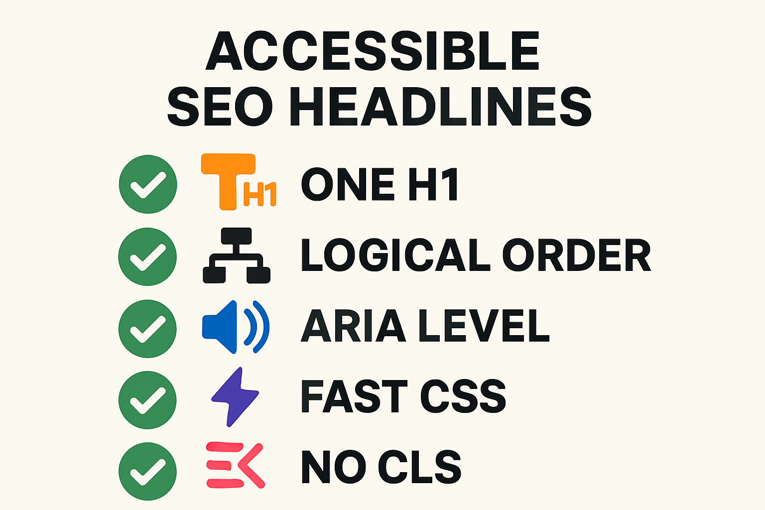
Testing Your Headline Component
React Testing Library: Behavior Over Implementation
import { render, screen } from '@testing-library/react';
import { Headline } from './Headline';

test('renders correct role/level and text', () => {
  render(<Headline as="h2">Features</Headline>);
  const h = screen.getByRole('heading', { level: 2 });
  expect(h).toHaveTextContent('Features');
});

test('forwards data attributes', () => {
  render(<Headline data-test="hero">Hero</Headline>);
  expect(screen.getByText('Hero')).toHaveAttribute('data-test', 'hero');
});
Type Tests and Linting
tsd tests to ensure invalid prop values fail to compile.as usage conventions and a single h1.Common Mistakes and How to Fix Them
Not Forwarding className/style or Rest Props
Fix: Accept className and style, and spread {...rest} onto the element. This preserves id, aria-*, and testing hooks.
Using defaultProps on Function Components
Fix: Prefer parameter defaults and ?? to set a react props default value. It works better with TypeScript and avoids edge cases.
Breaking the as Prop with Invalid Attributes
Fix: Type your component with React.HTMLAttributes<HTMLHeadingElement> or a polymorphic generic so only valid attributes are allowed for the chosen tag.
Quick FAQ
Can I use both children and a text prop?
Yes. Prefer children for rich markup. If both exist, let children take precedence and fall back to text when children is undefined.
How do I set default values for optional props?
Use function parameter defaults and nullish coalescing (??). Avoid defaultProps on function components.
Should I use PropTypes with TypeScript?
TypeScript handles compile-time checks. PropTypes can add runtime safety when third-party JS code consumes your component.
What's the best way to type the as prop?
Start with React.HTMLAttributes<HTMLHeadingElement>. For full polymorphism, use generics and forwardRef to derive valid attributes from the chosen element.
Where can I learn more about props?
Read React's official "Passing Props to a Component" and Next.js's props tutorial for quick refresher examples.
Try It Now: Design and Export with Pretty Headline
Design a headline visually, export clean React code, and plug it into the typed component you just built. Start here, or browse ideas in our Blog Title Generator, Ad Headline Generator & Social Tools.
Call to Action
Design your headline using the editor and export it as HTML, React code, PNG, JPG, or WebP.
Start Designing Now →Further reading: React's official docs on passing props and a practical explanation of the as prop pattern.