Bold Italic Font Headline Mastery: Design Guide for 2025
Your headline has one job: win the click. The fastest way to do that in 2025 is strategic emphasis — the right bold italic font choices that direct attention without adding noise.
In this guide, you'll learn when to use bold vs italics (and when to combine), how to implement emphasis with semantic HTML/CSS, font pairing tips, a step-by-step build in Pretty Headline, and testing for impact.
Why Bold + Italics Matter for Headlines in 2025
Done well, bold italics can speed scanning, clarify your promise, and improve click behavior. Done poorly, they create clutter. Your goal: emphasize meaning, not just style.
Throughout, we'll use the terms bold italics, italic style, and italic format in their practical, design-focused sense.
Cognitive Impact: How Emphasis Guides the Eye
Readers scan in chunks. A bold primary phrase establishes the promise; selective italic words add contrast for a secondary detail. This reduces cognitive load and improves the scan path.
Prominence effect
Bold increases visual weight so viewers anchor on value words first.
Contrast effect
True italics (not skewed faux) provide shape contrast that highlights nuance.
Retention
Emphasis that clarifies meaning (not just style) improves understanding and recall.
Before-and-After Mini Examples
Quick transformations to illustrate best practices using a bold italic font:
Write better headlines faster
Write Better Headlines 10x Faster
Email marketing tips for small teams
Email Marketing Tips For Small Teams
Design landing pages that convert more traffic
Design Landing Pages That Convert More
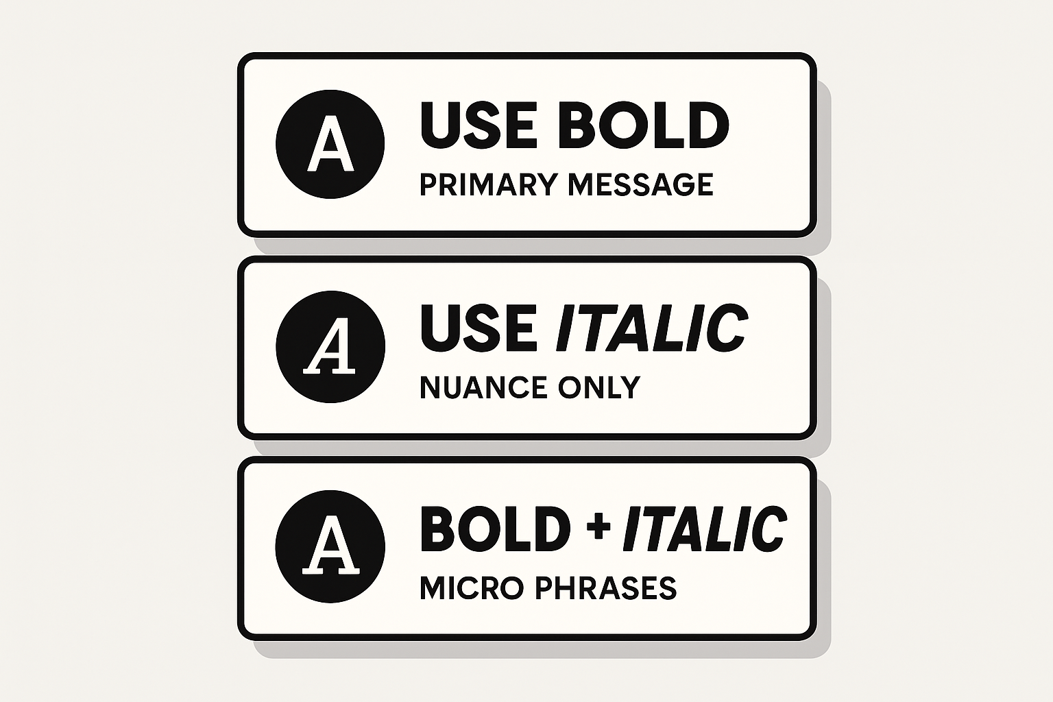
Quick reference: When to use bold, italics, and both
When to Use Bold vs Italics (and When to Combine)
Use this quick rule of thumb:
Italics: Contrast, Titles, and Nuance
Use italics for subtle emphasis without shouting. Good for terms, foreign words, or titles of longer works. Avoid long italic spans in headlines — they lower readability and strain users with cognitive impairments. Keep italic text font sizes generous and contrast high.
Bold: Primary Message and Key Phrases
Bold declares the point. It's ideal for the value proposition and the strongest nouns/verbs. In a headline, try bolding 40–60% of the words — typically the first phrase. Use bold italic text only if a short sub-phrase must stand out within a bold chunk.
Combining Both Without Visual Clutter
- Limit bold italics to 1 micro-phrase per headline.
- Keep the micro-phrase under 3 words; avoid all caps + italics together.
- Increase letter-spacing slightly on heavy weights to maintain legibility.
- Always A/B test combinations for your audience and device mix.
Implementation Basics: Semantic HTML and CSS
Use semantic emphasis so both crawlers and screen readers understand your intent. Avoid non-semantic styling that only looks right visually.
Using <em> and <strong> vs <i> and <b>
<strong>: conveys importance (typically renders bold).<em>: conveys emphasis (typically renders italics).<b> and <i>: presentational only; use when you need styling without semantic meaning (e.g., icon labels, taxonomic names).Minimal example:
<h1><strong>Write Better Headlines</strong> <em>10x Faster</em></h1>CSS Controls: font-weight, font-style, Variable Fonts
- Prefer true italic cuts via
font-style: italic;over skew transforms. - Use numeric
font-weight(e.g., 600–800) to fine-tune heaviness. - With variable fonts, adjust
font-variation-settingsfor precise bold italic font style. - Load only needed weights/italics to keep performance high.
Avoid Faux Italics and Accessibility Pitfalls
- Do not use
transform: skew()for italics; it harms legibility. - Maintain color contrast (WCAG AA) and avoid long italic blocks.
- Keep semantics: rely on
<strong>/<em>for meaning; reserve<i>/<b>for purely visual cases.
Picking the Right Fonts (Google Fonts Best Practices)
Choose families with true italic cuts and multiple weights so your headlines remain crisp and controllable.
Pairing Ideas and Contrast Ratios
Cursive vs Serif/Sans: When to Use Bold Cursive
- Use bold italic cursive font styles for short, emotional words (e.g., "Free", "New", "Sale").
- Limit to hero graphics or single-line headlines; avoid paragraphs and long phrases.
- Ensure generous letter spacing and large sizes to preserve legibility.
Step-by-Step: Design a Bold Italic Headline in Pretty Headline
Pretty Headline is a free, fast, browser-based headline designer with Google Fonts, WYSIWYG editing, and instant export to HTML, React, PNG, JPG, and WebP — no signup.
1) Choose Your Font Family and Weights
- Open the editor and select a family with true italics and multiple weights (e.g., Rubik, Lora, Inter).
- Load at least one bold (700–800) and one regular/medium (400–600) plus italics.
- Preview letter shapes to ensure italic font letters are clear on your background.
2) Apply Emphasis Patterns (Bold, Italic, Bold+Italic)
- Bold the core promise. Use italics for a clarifier. Reserve bold italics for a short micro-phrase.
- Check mobile breakpoints in the live preview and adjust line breaks or spacing.
- Keep your emphasis ratio roughly 60/30/10 (bold/roman/italic) as a starting point.
3) Export to HTML, React, PNG/JPG/WebP
- Export production-ready HTML or React code for your site.
- Create image exports for social posts to preserve styling across platforms.
- Integrate in minutes without accounts or downloads.
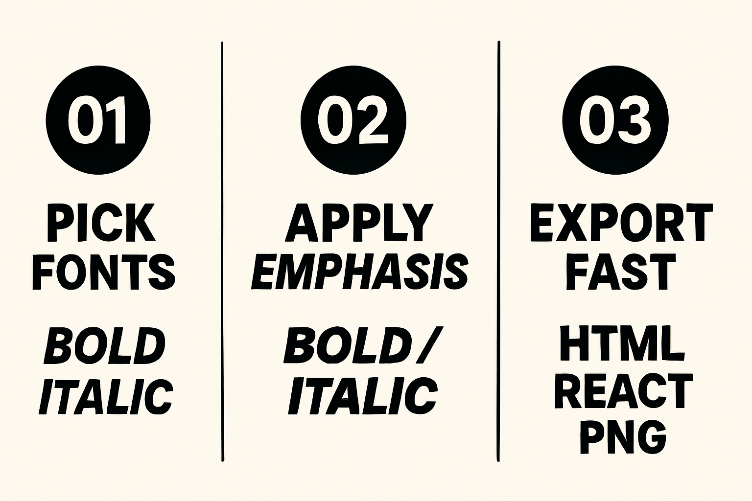
Three-step workflow: Choose fonts → Apply emphasis → Export
New to the workflow? See the quickstart in Getting Started with Pretty Headline or try a one-minute build in Create Title in 60 Seconds.
Social Platforms: Real Italics vs "Styled Text" Generators
Facebook and Instagram don't offer rich text italics in normal captions. Styled-text generators (e.g., yaytext bold, yaytext italic) swap letters for Unicode lookalikes. They "look" bold/italic, but come with tradeoffs.
What Styled-Text Tools Do (Unicode) and Tradeoffs
- They replace ASCII with Unicode symbols that mimic bold italic text.
- Potential issues: accessibility (screen readers), search discoverability, and deliverability in emails/ads.
- Use sparingly; prefer platform-native emphasis or images for key messages.
Safer Options for Facebook and Instagram
- Write clear, plain captions; use line breaks, emojis, and ALL CAPS sparingly for emphasis.
- Keep the headline itself on the image or in the first line of the post.
- Test different first-line hooks with UTM links to measure CTR.
Need quick social headline ideas? Try our roundup: Best Free Headline Generator Tools in 2025 and industry-specific examples in Blog Title Generator, Ad Headline Generator Social Tools for 2025.
Create Share-Ready Images with Pretty Headline
Export PNG/JPG/WebP from Pretty Headline to ensure the exact bold italic font style renders everywhere. This approach preserves your design, avoids Unicode pitfalls, and keeps brand consistency. Perfect for ads, reels covers, and Stories.
Testing, Performance, and SEO
Validate the impact of your emphasis decisions and keep the page fast.
A/B Test Your Emphasis Ratio
- Define variants: Bold-only vs bold+italic; adjust weight and phrasing.
- Set metrics: CTR, time on page, bounce, scroll to CTA.
- Split traffic: 50/50 for at least one business cycle.
- Decide: Keep the version with higher CTR and equal or better readability.
Performance: Fonts, Subsetting, and CLS
- Load only needed styles (e.g., 400, 700, 400 italic, 700 italic).
- Use
font-display: swapand consider preloading critical fonts. - Subset Latin only if that's all you need; avoid shipping unused glyph ranges.
- Prevent layout shifts: set fallback stacks with similar metrics and define explicit sizes.
SEO & Accessibility: Meaningful <strong>/<em>
- Use
<strong>for importance,<em>for emphasis so crawlers and screen readers infer meaning. - Avoid overusing italics; keep readability high across devices.
- Ensure alt text and headings reflect the message, not just styling.
Troubleshooting Common Issues
Quick fixes for rendering, contrast, and over-emphasis.
Bold/Italics Not Rendering as Expected
- Confirm the italic and bold font files are actually loaded; many families require separate URLs for italics.
- Check CSS overrides (
font-style: normal !importantor weight clamping). - Ensure your fallback font has corresponding styles; mismatch causes sudden style changes.
Contrast and Readability Fixes
- Increase size, line-height, and letter-spacing for heavy weights.
- Boost contrast or move italics to the subhead if the headline is long.
- Consider a different italic type font with clearer letterforms.
Too Much Emphasis? Simplify the Mix
- Make only the first phrase bold; convert the rest to regular.
- Use italics for a single 1–3 word clarifier.
- Remove decorative underlines or colors until hierarchy reads cleanly.
Copy-Ready Templates and Snippets
Paste-ready patterns to move fast.
HTML/React Headline Templates
HTML:
<h1><strong>Grow Revenue</strong> <em>Without More Traffic</em></h1>React JSX:
<h1><strong>Ship Faster</strong> <em>With Fewer Revisions</em></h1>Bold + italic micro-phrase:
<h1><strong>Launch in</strong> <strong><em>One Day</em></strong></h1>CSS Utility Classes for Emphasis
.is-bold { font-weight: 700; }.is-italic { font-style: italic; }.is-bold-italic { font-weight: 700; font-style: italic; }.tight { letter-spacing: -0.01em; }.loose { letter-spacing: 0.02em; }Want news-style titles? Explore Newspaper Headline Generator for punchy structures.
Quick Checklist and Next Steps
- Bold the promise; italicize the nuance.
- Use semantic
<strong>/<em>; avoid faux italics. - Pick families with true italic cuts and strong bold weights.
- Test emphasis ratios; load only required font styles.
- For socials, export images to preserve styling.
Build your next headline now: Design your headline using the editor and export it as HTML, React code, PNG, JPG, or WebP.
Try Pretty Headline Free →FAQ
What is the fastest way to style a headline with bold and italics?
Use <strong> for the main phrase and <em> for a short clarifier. In Pretty Headline, select text and click Bold or Italic, then export.
Should I use bold italic text for entire headlines?
No. Reserve bold italics for a short micro-phrase (1–3 words). Full bold italic headlines reduce readability and look heavy.
Which fonts support true italics on the web?
Popular options include Inter, Roboto, Source Sans 3, Lora, Merriweather, and Rubik. Always load the italic files, not just the roman weights.
Are Unicode styled-text generators safe for SEO?
They can harm accessibility and discoverability. Prefer native HTML/CSS or export images for social posts to preserve design intent.
How do I keep pages fast when adding italics and bold weights?
Subset fonts, load only needed weights, use font-display: swap, and preload critical files to minimize CLS and delays.